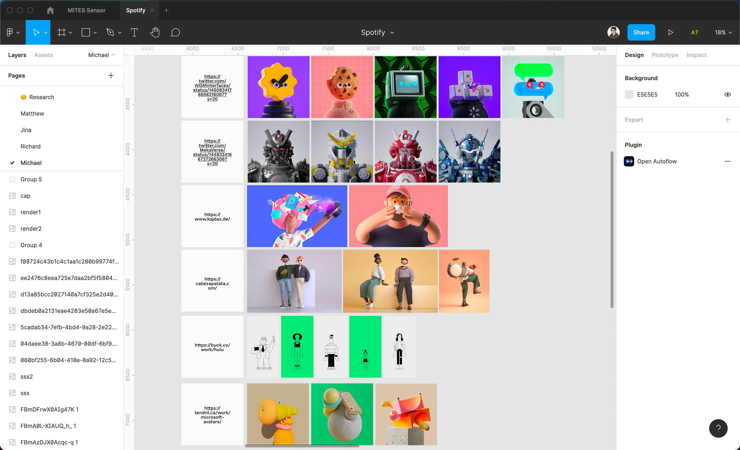
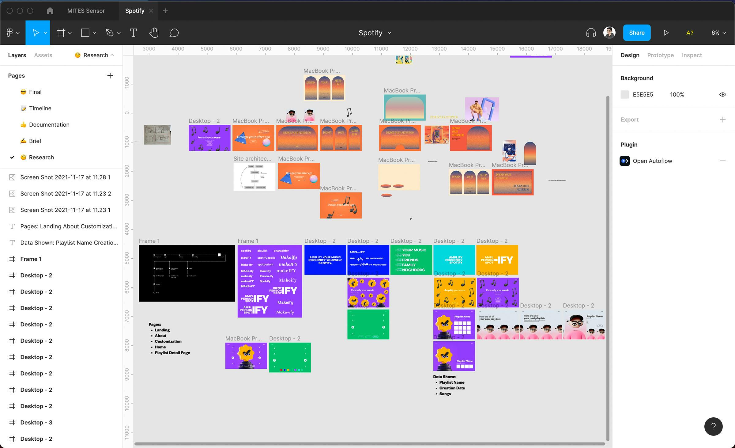
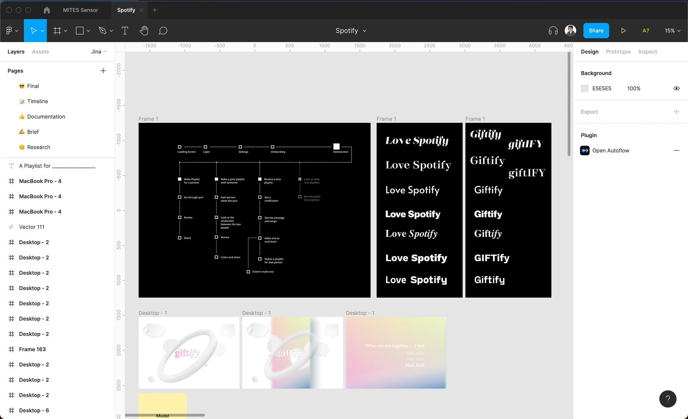
Process > Concept Development and Moodboarding
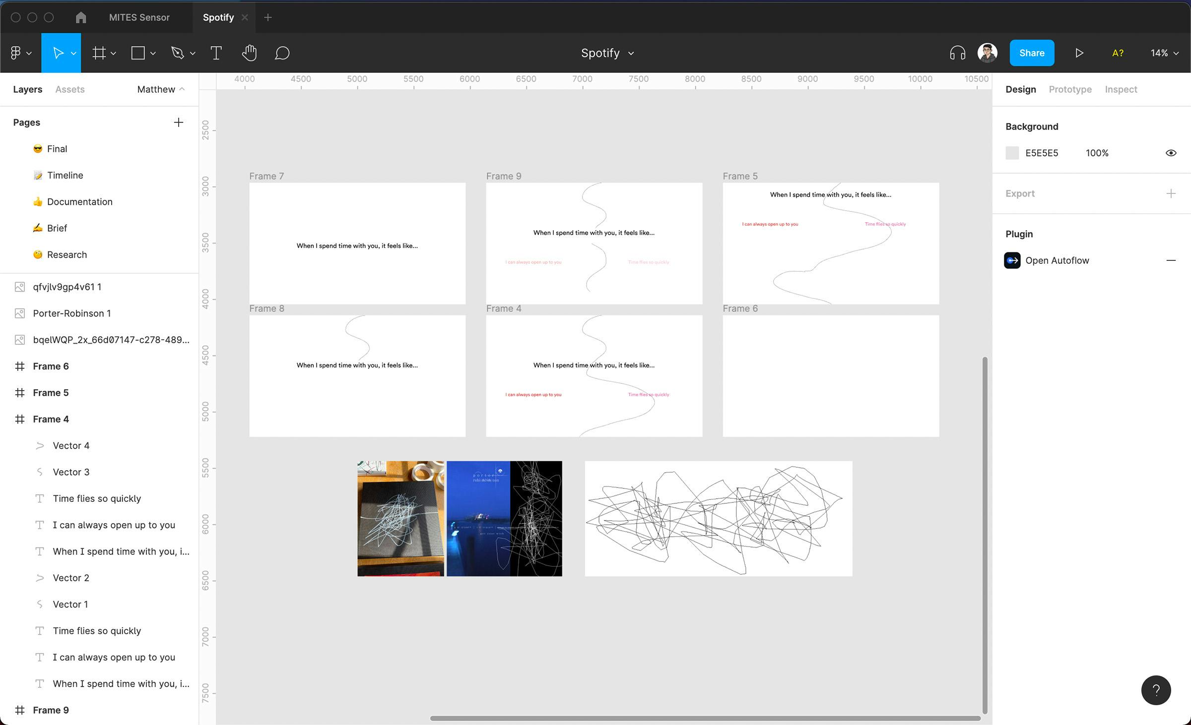
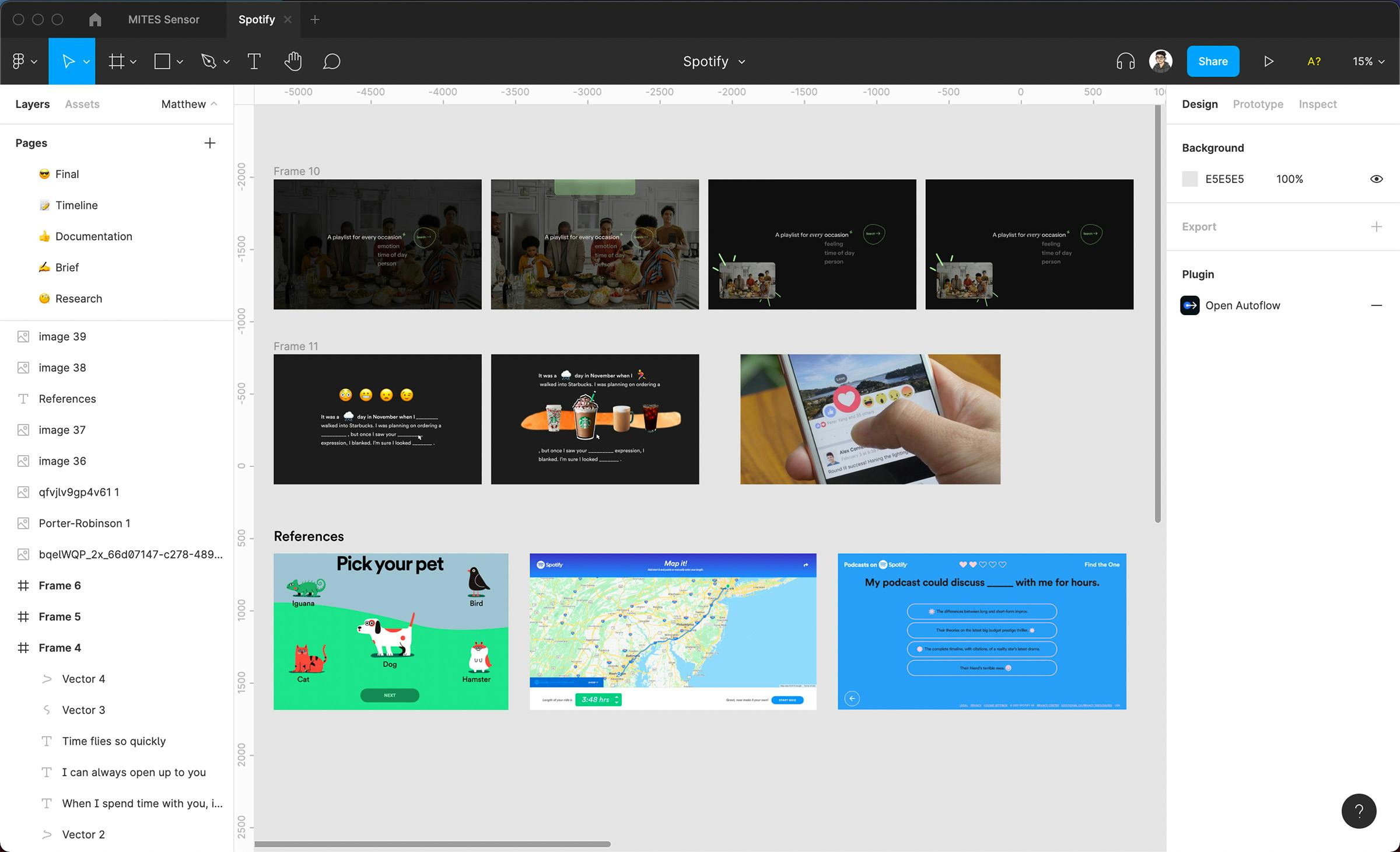
We wanted to address the problem of creative, unorthodox playlist generation. We started off by listing all the ideas that came to mind and started leaning heavily towards an interactive platform that used some of the visitor’s own personality traits to influence their music taste. Inspired by examples from Spotify’s Playlist for Pets and Every Noise at Once, we experimented with ideas from mad libs to a quiz taken between two romantic partners. Some explorations focused on different target audiences and context/atmospheres while others revolved around visual styles and playing with Spotify’s existing brand guidelines.
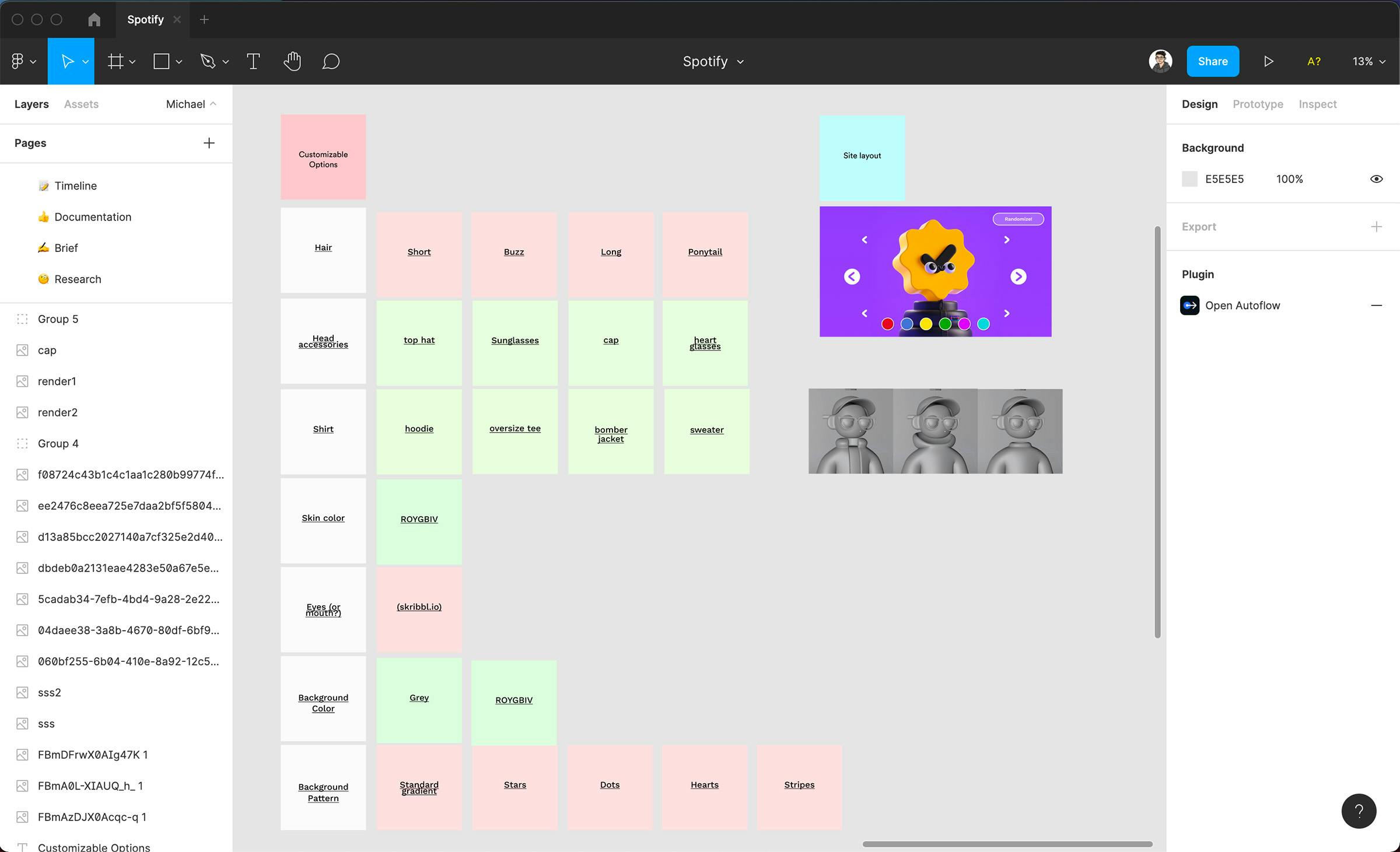
After pivoting towards a more visual concept that focused on customizing a 3-D avatar, we again came up with categories, accessories, and sketches for interface ideas. These choices would dictate different query parameters for the Spotify API such as acousticness, danceability, or speechiness for the generated recommendations. By ideating around these diverging diamonds, we found it easier to make the experience intuitive, resonate with the audience, and delightful to use.
Process > Iterating with WebGL
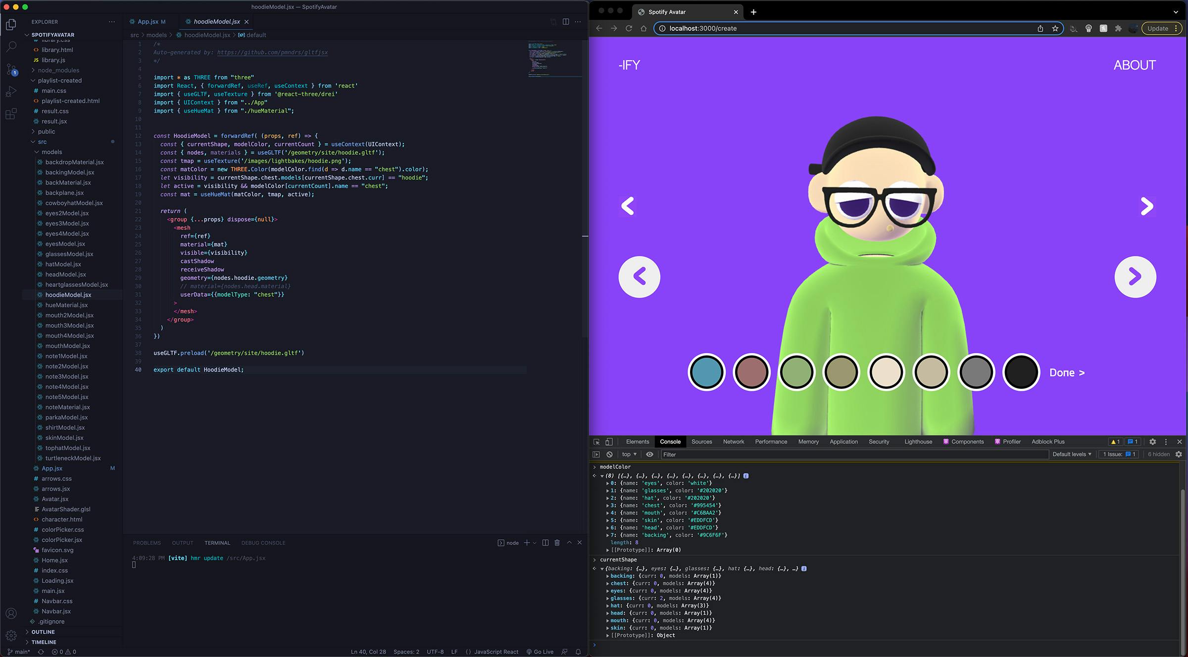
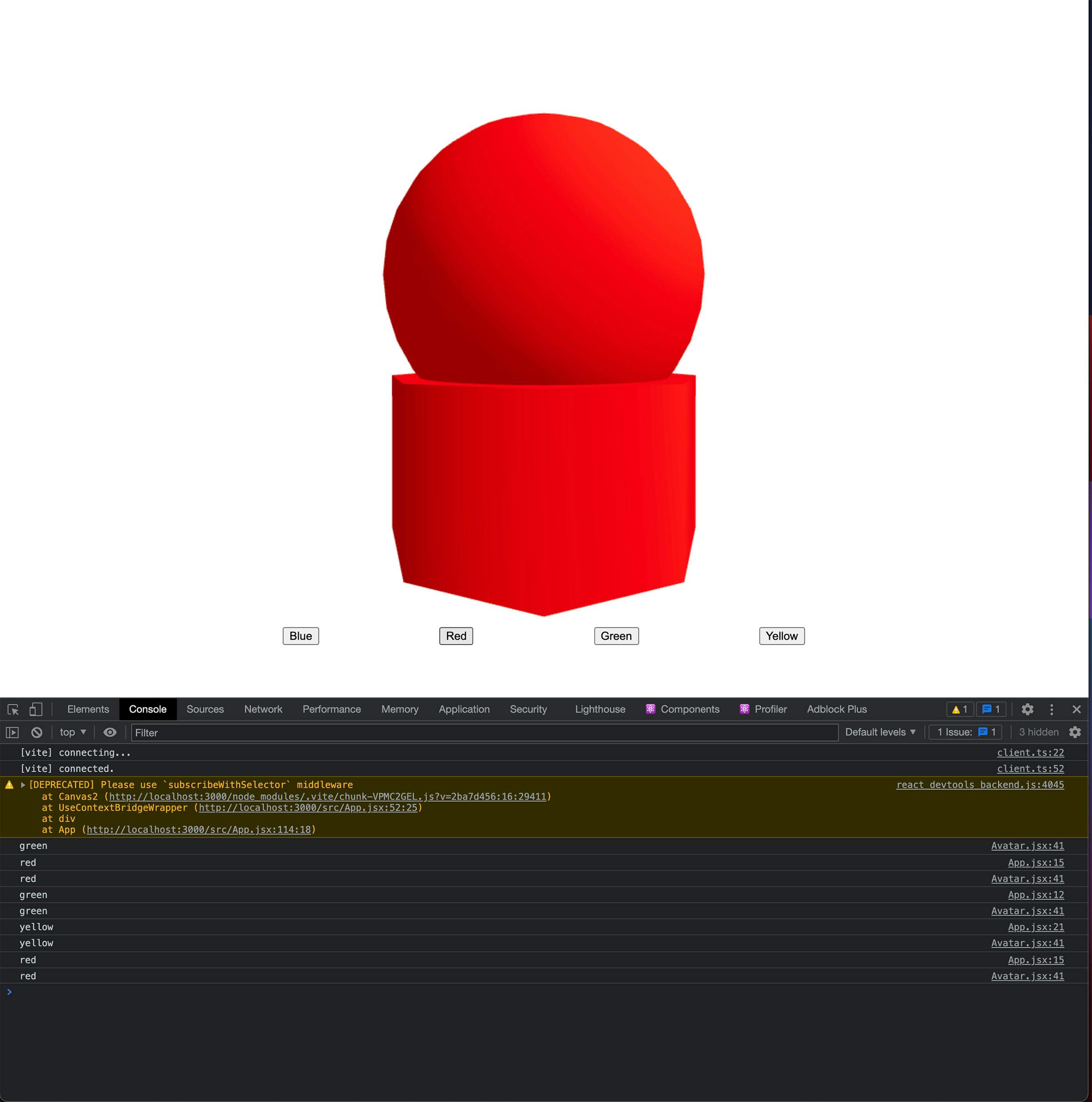
While other members of the team were working on modeling the assets for the avatars, we started building the application on React-Three-Fiber, a library that works over WebGL. Our first demos were simple spheres and cylinders to test how to best pass colors to the shader. Instead of baking out separate textures for each model, we instead baked a single shadow and ambient occlusion pass that was completely devoid of any color to make the overall size of the asset library smaller. The colors were then multiplied in at render time through the fragment shader, removing the need for external lights in the scene and dramatically reducing the amount of calculations the renderer needed to do.
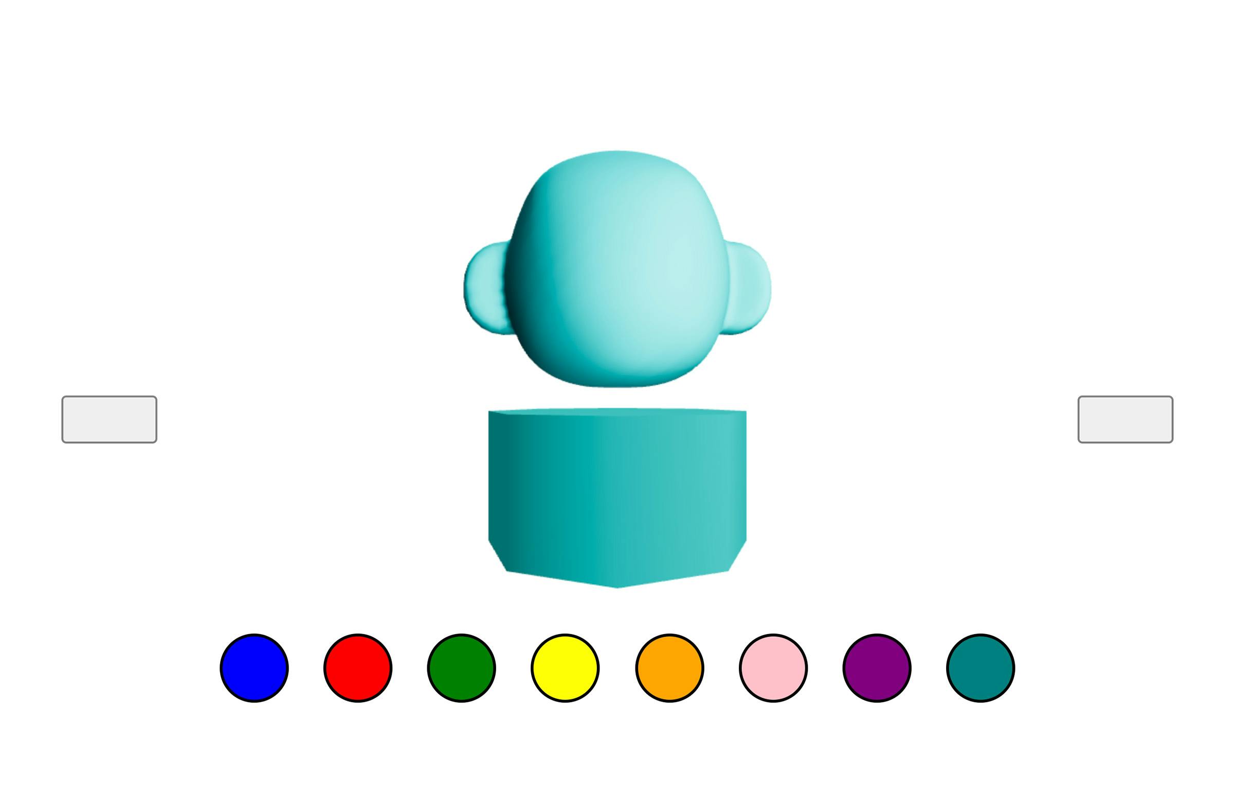
We followed this process for the rest of the assets, making sure each was in the right position and groups. On simpler scenes like the main menu, the baked lighting and added diffuse color was enough since the scene was static, but the character creation page needed to link the user interface to be able to tweak the colors and models on the fly.
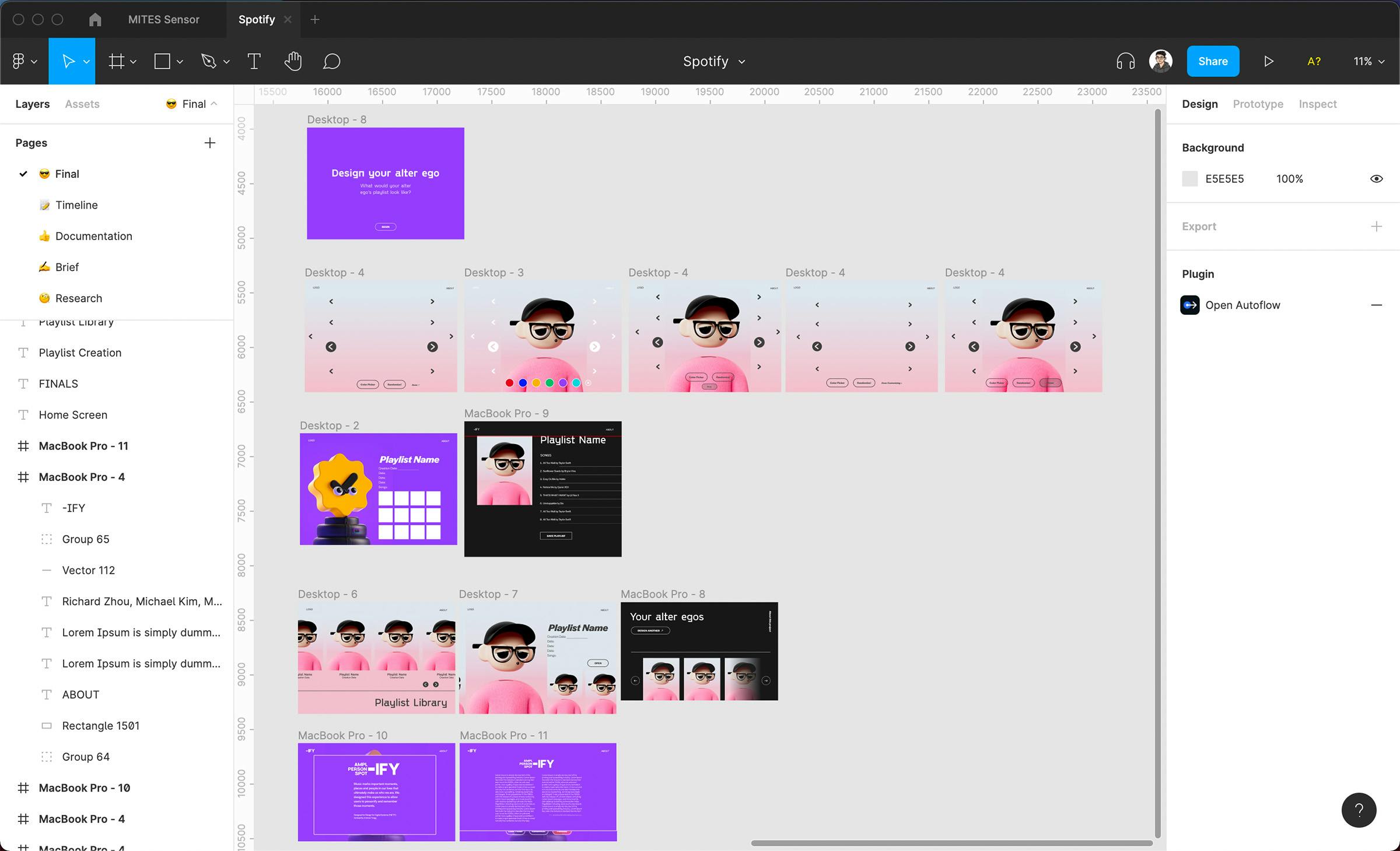
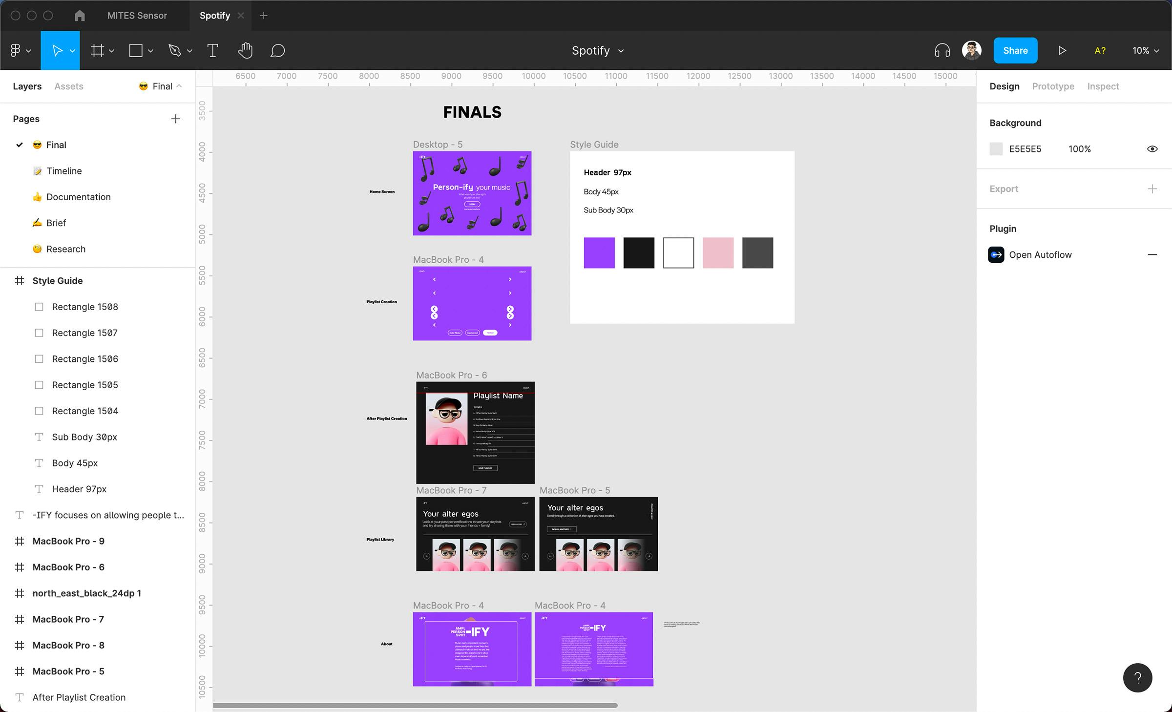
Process > User Flows and Visual Language
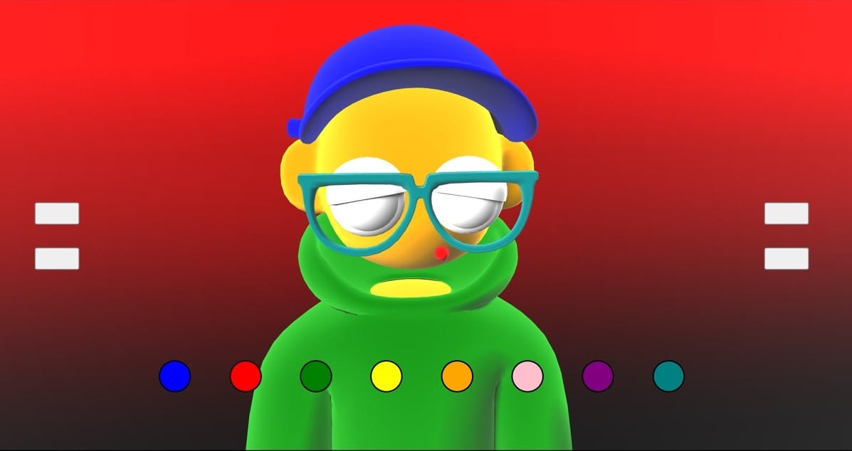
Every session, we swapped between updating our progress on technical checkpoints and style development. We tried illustrative styles, typography size and weight to convey an energetic and unexpected tone to our quiz, and played with different color palettes to see how they gelled with the permutations of our avatar. We settled on a dark, saturated purple as our primary color so that our avatar stood out more, dark grey background elements for a similar value, and white-on-purple text with weight as our main way of establishing visual hierarchy. Our final flow started with a brief introduction screen and moved to either character creation (with a pop-up screen for more information) and the following playlist information screen or browsing user-made avatars from previous interactions.
Process > State Management and Refinement
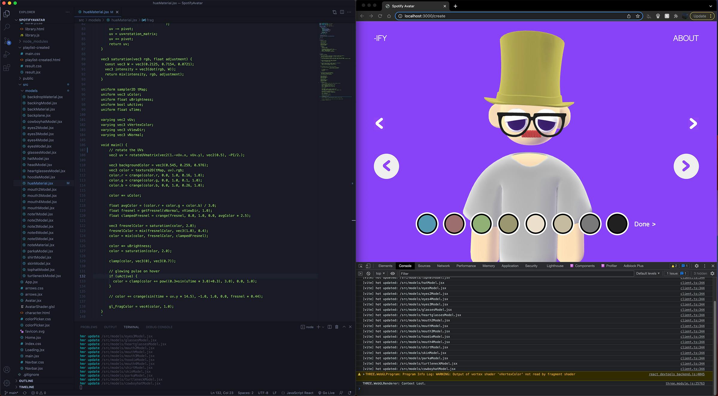
The primary global state was handled by an object that kept track of three main parameters: the current model in each category being displayed, the current color of that model, and which category was actively being selected in that moment. This was then passed through the app through a context bridge and used a (headache-inducing at times) reducer function to handle all the button logic. Pressing the left and right buttons changed the model being displayed from a hoodie to a parka, while the up and down buttons changed the category from jackets to hats.
Each model was its own component that referenced the current state and passed these parameters to the individual model’s shaders. Having all the models separated made the code clearer, easier to reuse, and maximized reuse.
We noticed that users trying our demo for the first time would often be confused on where to start since there was little feedback on what the buttons do. We added some more obvious hierarchy on which buttons to try and picked starting colors on the model that matched the given palette more closely. In addition, we added a pulsing glow effect in the fragment shader to tell the user which piece of clothing or accessory they were modifying. The change, although slight, helped dramatically in reducing the confusion when users first loaded in and started trying options.